Using Bootstrap
The current version of Bootstrap is 4.5; new versions come out regularly. When you’re looking at documentation on the web to figure out how to do something in Bootstrap, be sure to note the version number. Version 4 is very different from version 3. So, a lot of older advice about Bootstrap can lead you in the wrong direction.
Let’s walkthrough a page created with Bootstrap 4. First, here’s the plain page without any Bootstrap code:
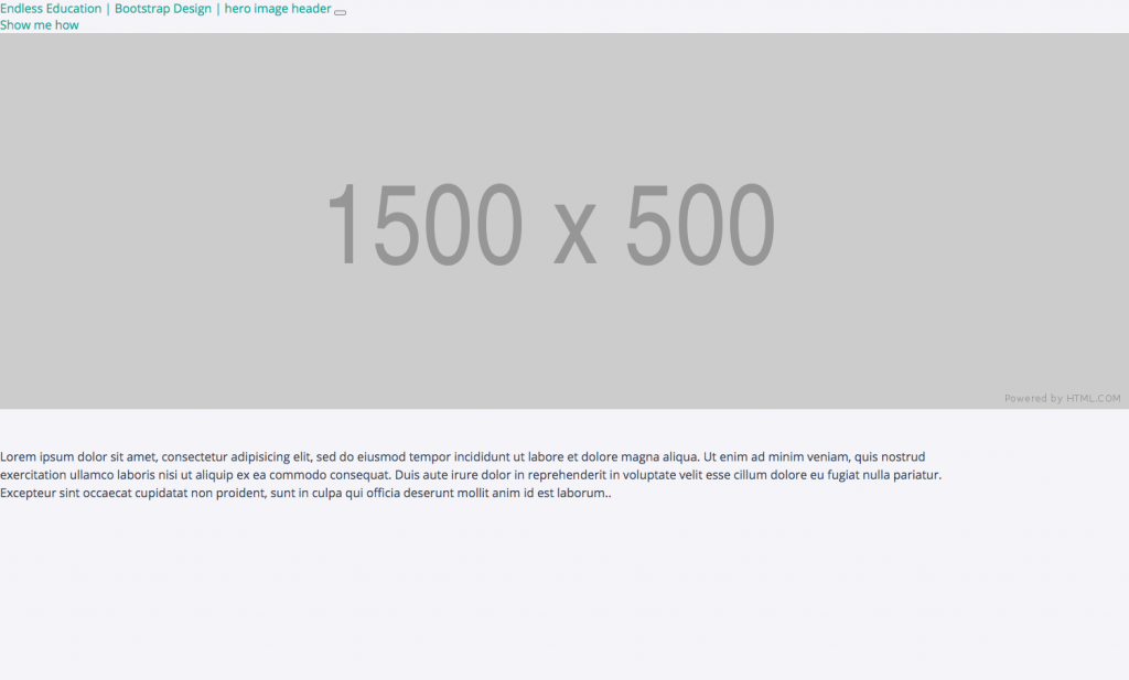
It’s quite boring: some links at the top, a full-width image, and a paragraph of text.
Here’s the same page with Bootstrap:
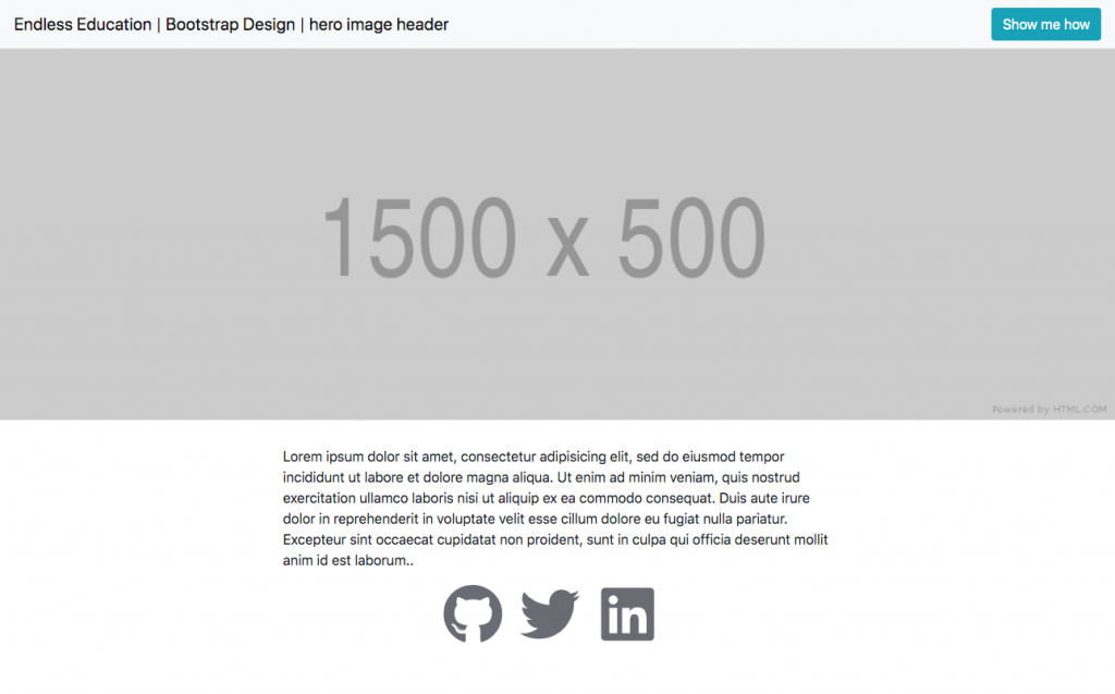
Notice the navbar is looking nicer, and the paragraph is well formatted. Plus, this file also uses the free Font Awesome to add in those iconic links to GitHub, Twitter, and LinkedIn.
Before we take a close look at how Bootstrap works, here’s my own web page using this same code:

On my site, I opted not to use a navbar. I actually have a lot of different web sites, so I wanted my personal branded page to be minimal and distinguished by a unique image.
This code is freely available in case you want to use it for your own site. See the code repository at https://github.com/jeffreybarry/bootstrap-hero and a live version of the site: https://jeffreybarry.github.io/bootstrap-hero/bd-hero.html
Code Walkthrough
Let’s take a look at what’s happening.
Step 1 in using Bootstrap
Since Bootstrap is a CSS framework, keep in mind that it’s really just a bunch of CSS code that you can freely use. How do you use? Well, how would you use any CSS code? You have to link to the CSS file for Bootstrap.
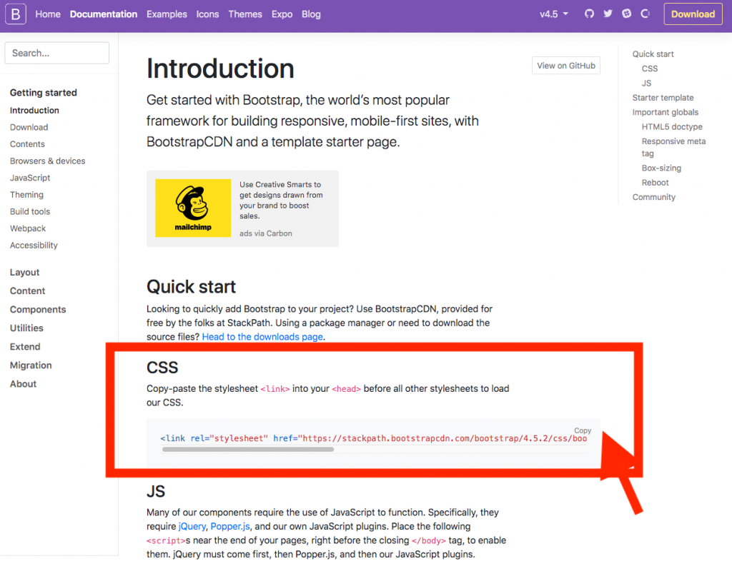
Bootstrap makes this really easy for you. Just go to the getting started page on the Bootstrap site. Look for the CSS link. There’s a convenient copy button that copies the entire link to your clipboard to make copy-and-paste super easy.
Be sure that you’re always using the latest production release of Bootstrap. As of this writing, it’s version 4.5 You can locate the current version number in the navbar:
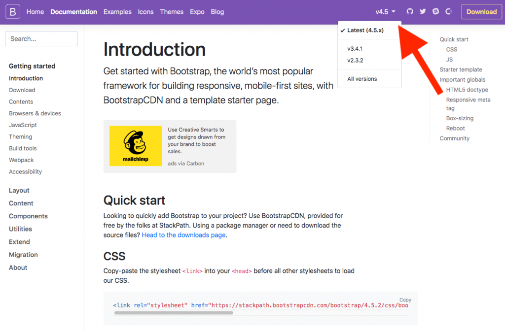
Google searches often will point you to an outdated version number, so be sure to check.
Now that you’ve copied the Bootstrap CSS link to your clipboard, you simply want to paste it into the head section of your HTML file:
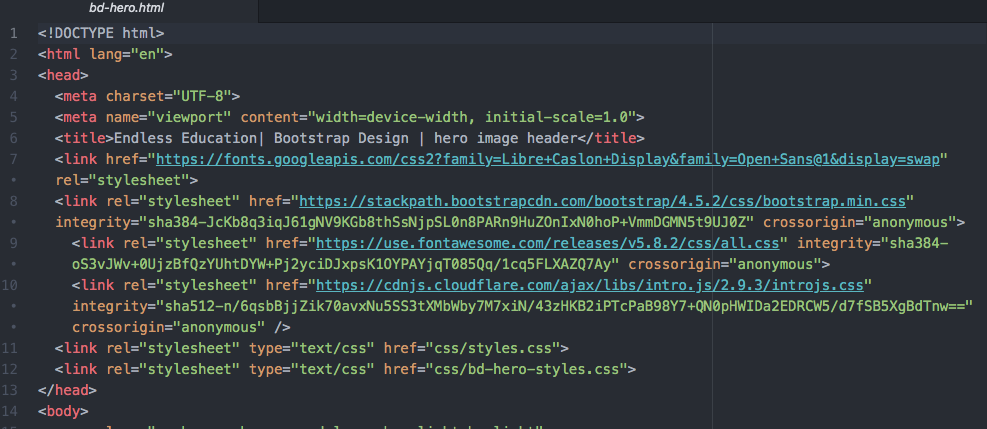
There are a few things happening here in this head section. Let’s look at certain line numbers, but focus on line 8:
line 7: links to Google font
line 8: links to the Bootstrap CSS file. Note that the file extension at the end of URL in the href is simply .css. Again, remember, that Bootstrap is mainly just a CSS file that someone else developed for you to use.
line 9: links to Font Awesome, which is also just a CSS file.
line 10: links to a special CSS file for the code walkthrough. (You will not be using this link in any of your files, but I included it so that you could see how it works.)
line 11: links to an overall styles.css file for my website
line 12: links to a specific bd-hero-styles.css for this page.
The lesson learned through all these links is that an HTML file can link to multiple CSS files. Very important: the order in which the CSS files are listed in the head section determines the order in which the browser reads the files. Remember that files listed later overwrite any earlier CSS code. This is very important to remember since it may trip you up if you put the Bootstrap CSS after your own CSS file. In that case, none of your own CSS code will appear on the web page.
Also, you can and most likely will want to combine the contents of styles.css and bd-hero-styles.css into a single styles.css file. For a project I’m working on, I needed to have the files separate. But on your site, you’re unlikely to have that need.
Step 2: Creating the navbar with Bootstrap
Navbars can be a bit tricky, especially when developing one from scratch in plain CSS. Indeed, the convenience of the navbar code in Bootstrap is one of the reasons I use Bootstrap.
The Bootstrap documentation provides sample code for various types of navbars. You can copy/paste this code into your own project. That documentation page can be rather confusing when you first look at it.
Step 3: Creating containers in Bootstrap
In this step, we will go over the initial step in defining a layout in Bootstrap: setting up a container for the grid. Containers, as the name suggest, contain the grid that controls the layout of the content. In other words, containers also contain the content. . A web page may have one containers or multiple containers. Containers can be nested, but in most cases you don’t use nested containers.
How do you define a container in Bootstrap? Remember that Bootstrap is a set of CSS code. So, it comes with a .container class. You add this .container class to an HTML element in the body of the HTML page. Most often, you will add the .container class to an HTML element such as main, section, article, or div.
By default, the .container class comes with padding that provides an attractive left and right margin. That makes the content look centered on the web page without you needing to do anything else.
In some cases, you will the content to stretch all the way across a page without any margin. This is most common when using an image that you want to fully span the width of the page. You implement this style by using the class .container-fluid instead of .container.
Terms. Be sure to understand the following three terms when working with grid layouts.
Viewport: the part of the web page that is visible within the browser. The viewport is only what you see at a particular time. The viewport does not include the entire web page if you have to scroll to see the rest of the web page. The browser automatically knows what parts of the page is visible on the screen. This information, known as the viewport, is very useful in developing web pages, particularly when you add interactions or behaviors that you only want to start activating when a person scrolls into a certain area of the page.
In terms of layout and responsive design, the viewport keeps track of the width of the visible page within the browser.
Breakpoints: A breakpoint is a specified width of the viewport, e.g., 960px. When the browser is adjusted to go beyond or below that width, i.e., breakpoint, the design can respond with a change of layout to accommodate the smaller or larger width. This is where responsive design comes into play.
Min-width: the viewport width in pixels at which
Bootstrap sets sizes for the following widths as max-width and breakpoints:
|
Small ≥ 576px |
Medium ≥ 768px |
Large ≥ 992px |
Extra Large ≥ 1200px |
When use the class .container, the width of the container changes depending upon the width of the viewport. While this may seem confusing at first, this feature allows you to specify in your CSS different layouts for different widths. Obviously, phones have viewports with smaller widths than laptop and desktop computers. That’s where having your content in a container that can automatically adjust based on the viewport width is really helpful.
Creating Grids in Bootstrap
Always keep in mind that Bootstrap is a set of predefined CSS classes that you can use in your HTML. Bootstrap allows you to easily define a grid that is 12 columns wide. And you can add as many or as few rows as you need.
To define a grid, start with the container. Then you define the number of columns, and then a row.
<main class="container">
<section class="col-10 offset-1">
<div class="row">
<h1>This is a heading</h1>
<p>This is a paragraph of text</p>
</div>
</section>
</main>
The code above shows a simple Bootstrap grid that is 10 columns wide, and that is offset by 1 column on the left margin. The offset provides extra margin.