The redesign of Interlitq is going extremely well. We’re on a timeline to have the redesign completed this spring, and aiming for an early April release if at all possible. A literary magazine is one of the more complex types of sites to redesign. On the surface it looks quite simple: modify the header, adjust the color palette, update the typography and call it done. But there’s much more once you dig into all the elements that make a literary magazine on the web.
Branding
In continuous publication now for over a decade, Interlitq has retained the same design since it began in 2007. Yes, that now looks very dated but there are aspects of that design that form Interlitq’s visual identity. And we don’t want to do away with that entirely. Rather, we want to strengthen certain aspects and create a fresher set of visual elements through typography and judicious use of white space.
My opening step in any redesign is to pull out some graph paper and a pencil. Then I start sketching ideas that seek to uncover the overall structure of the site. Some of the graph paper ends up crumbled and tossed to the corner of the desk. Eventually, I find some drafts that capture the essence of each page of a site.
The first element a person encounters upon entering the website is the header. Here’s the (almost) original header from 2007:
![]()
I say almost the original header since the site did not originally include a blog. The blog tab was added a couple of years after Interlitq started. But the coding for the blog tab in the header was programmed so that it also appeared in the header of earlier issues as well. One thing to note that is now a historical artifact of web design is that this header image actually consisted of 10 individual images, plus 14 spacer gifs, all set within an HTML table. Actually, it’s an HTML table within a table. That was the complexity of web design in the early 2000s! But it looked good for the time, and it worked. Yet, there was something about the branding that wasn’t clear, e.g., was the site named Interlitq (or interLitQ) or was it The International Literary Quarterly? Or was The International Literary Quarterly a subtitle or simply a description of the interlitq.org site?
In 2010 a new header was designed for the site that solidified the branding on Interlitq as an original and memorable brand for the site. And the new header retained the thematic color scheme of the original.
![]()
The result was a slimmer header with a clearer emphasis on the Interlitq brand. This header still had the same problem, though, of being built out of multiple images. In the code the images have unwieldy filenames like menu_r1_c2a.gif. Here are examples of a couple of individual images that comprise the header:
![]()
![]()
Dealing with multiple images in a header menu is a technique of the past thanks to advances in CSS, the coding language used to style web pages.
I knew that any redesign needed to start with figuring out how to design the menu in CSS without using any images. Only the web tech readers of this post will realize how exciting that is! And, also, how important. Through using only text-based CSS in styling the header, then we can create a site that works well on all types of screens, including cell phones.
The new header uses no images and consists only of code. (Okay, for the simplicity of writing this post, I’m cheating a bit by using a screenshot of the new header but, believe me, it’s all code and looks very crisp and clear on the actual site.)
![]()
The entire header and menu is created through CSS, including the rounded corners on the lower edges and the slight shadow. The color palette has been updated and the type is all web-based.
One of the remarkable aspects of web development that enable non-image based design are web fonts. For Interlitq I chose two fonts from the freely available Google web fonts service: Cormorant Garamond and Lato. In the header, the word “Interlitq” is set in Cormorant Garamond and the text of the menu is set in Lato.
Home page and landing pages
The home page of a literary magazine, the web page you see when you enter the main address of the site, e.g., www.interlitq.org, often serves multiple functions. In the early years of Interlitq, the home page served as the introduction to each issue. At that time, Interlitq only published issues quarterly. Below is a screenshot of the very first home page for Interlitq, which also was Issue 1 in November 2007.
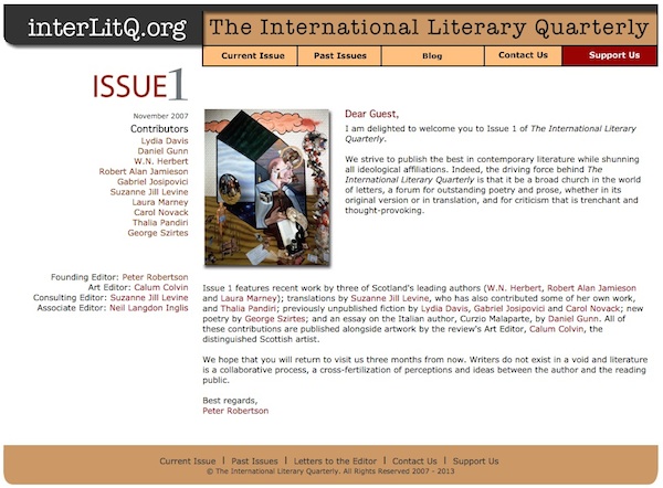
That page was really functional. The main text on the page was an introduction by the editor. A list of contributors appeared in the left side column and the masthead just underneath the contributor list. (Again, note that the header menu in the image above is the only part that differed slightly.) Though information about each author’s work is embedded in the editor’s introductory text, one essential element that is missing is a table of contents for the issue.
The home page for issues of Interlitq has been redesigned to the following layout:
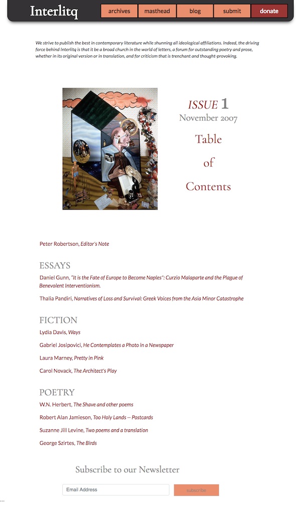
Noticeable changes here is an emphasis on an actual table of contents that gives prominence to the work of each author. The titles are the works are displayed as hyperlinks next to the authors. The works also are grouped by genre.
The next post in discussing this redesign in progress will examine how to handle the home page when the literary magazine switches from issues to publishing individual works on an irregular basis. That presents some challenges but can be handled quite well.
Leave a Reply