(#3 in a series)
One aspect that I personally value in web development is creativity. A site that takes an uncommon approach stands out. Of course, a lot depends upon what your client wants and what your users expect. For this type of site, though, we can be a bit experimental.
Consider the limitations of your design
You must consider the limitations of your design. Often those limitations are set by the needs of a client. Or, the limitations might simply be the limits of your skills considering the amount of time you have to complete the project. (Recognizing, of course, that you have the aptitude to learn any skills if you just had the time.) Another limitation, particularly with design, are the limits of available graphic assets, such as images and video.
For this project, I don’t have any original video or imagery of horseshoe bats in Asia and other imagery related to biology. I could, and will, use some stock footage but I don’t want to depend upon that. Also, I’m very interested in animation with SVG graphics, so that’s something I want to try to incorporate in the layout.
The thought process
In many ways, this site is a demonstration or a proof-of-concept work. I have a topic that I’m working on for no one other than myself and my daughter. But I’m also writing up the process behind creating this site as a learning process for others. In this regards, I’m willing to push the envelope and try out things that I don’t even know how to do yet. You’ll learn with me.
Sketching a layout
Pen and paper time again.
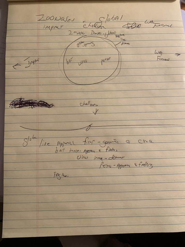
A lot of brainstorming happens at this stage. A key question: what type of imagery and symbolism do I associate with the core concept?
Zoonotic diseases are a world-wide phenomenon. The globe: an oval, a circle. Those are shapes I definitely want to use. Also, viruses are often represented as a circular form. On my notepad, I draw a big circle.
I’m intentionally avoiding a top menu. Remember, this type of site allows me to aim for something a bit different. But every site must keep navigational structure in mind. Going back to my mind map, three main sections stand out for this topic: impact, challenges, future. Those are the three paths I want to highlight for navigating the site’s contents.
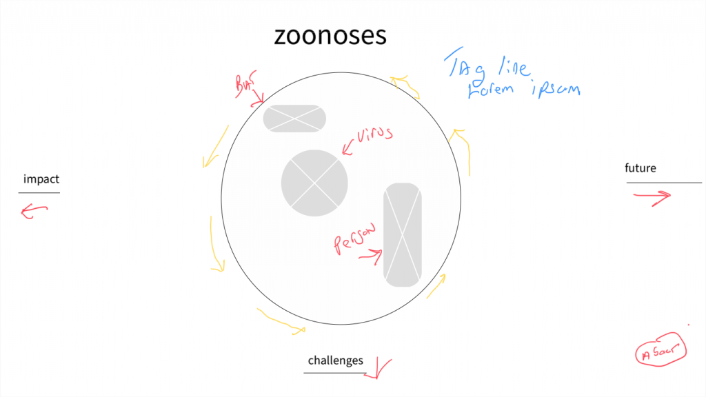
Continuing with the globe motif, those three paths can be represented as cardinal directions (west, south, east).
I like having a full screen site where one direction slides off to the right, another direction slides off to left, and the other direction slides down as the user scrolls the page. Here’s a rough visual reprsentation.
And a slightly more refined version done with Adobe XD, though any image tool would have done for something this simple:
The components
What do I have here so far? Enough to really get started on creating an initial page. Always remember that this is an iterative process. Don’t strive for perfection at any of these early stages. Strive for progress. Strive for incremental improvement.
At the top center of the screen, which I will refer to as page from now on, I have “zoonoses”. That’s a placeholder for the title. At this early stage, you’ll make a lot of use of placeholders.
The center of the page is going to be occupied by a circle that represents the globe. The keyword in that last sentence is represents. Maybe symbolizes is even better. That circle is not just going to appear there all at once.
The page will load blank with a colored background.
The circle will form dynamically as the first visual object on page load. We’ll start by showing the circle being drawn in a counter clockwise manner (as represented in the above image by the yellow arrows around the circle). In technical terms, this is animating the stroke of the circle. The fill of the circle will be transparent, i.e., the colored background of the page will show through. The effect will be that a circle will be drawn on the page.
Imagery of a bat will then animate in. The bat image will appear in the upper part of the circle. A placeholder image represents the bat in the above image.
Imagery of a virus will then animate in. The virus image appears in the middle of the cirlce.
Then the image of a person will animate in, which will be located in the bottom of the circle.
My initial thoughts: these images will all just fade in. That’s a start, but I probably want them to do something else interesting. Lots of possibilities but let’s focus on that later.
The title and tag line will then appear above and to the side of the circle.
Then appear the titles of the three sections on the left, bottom, and right of the page: impact, challenges, future.
An animated line, probably with an arrow, then appears that gives the user a visual clue as to which direction to scroll or click.
An about link should also appear somewhere on the opening screen but I don’t want it to dominate the page, so it might go in the lower corner though the upper right corner would be the most obvious place.
This rough prototype has determined the initial actions we need to take in coding this site.